Autoškola Bubo
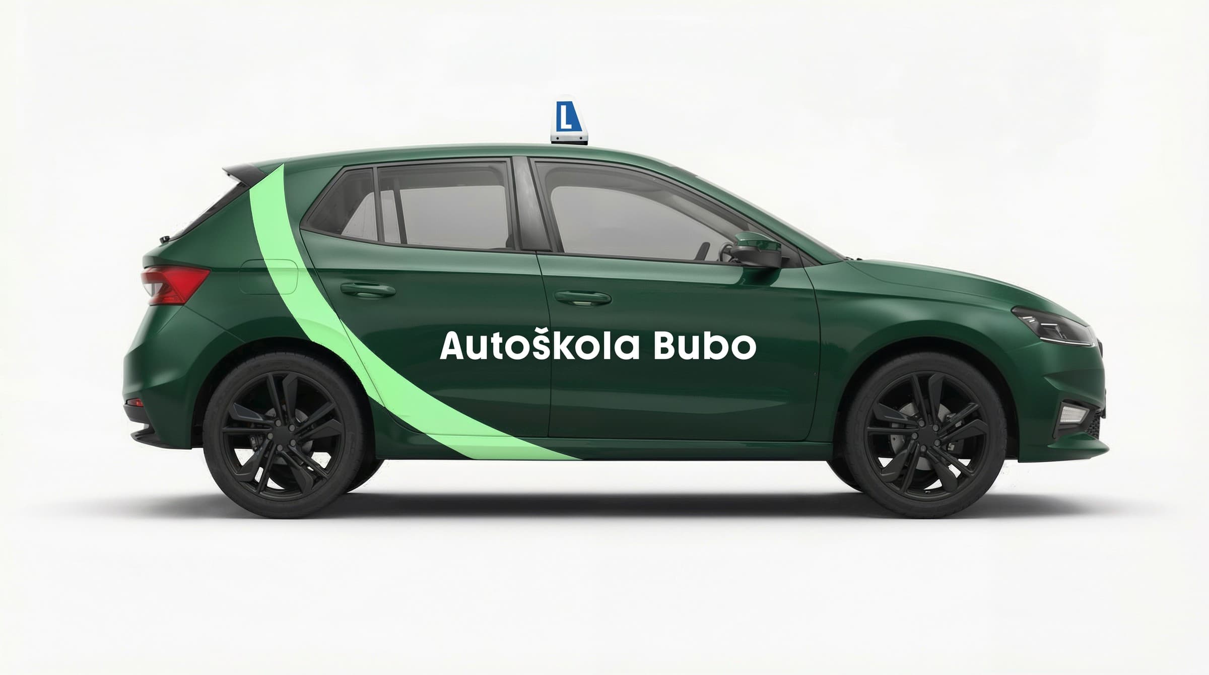
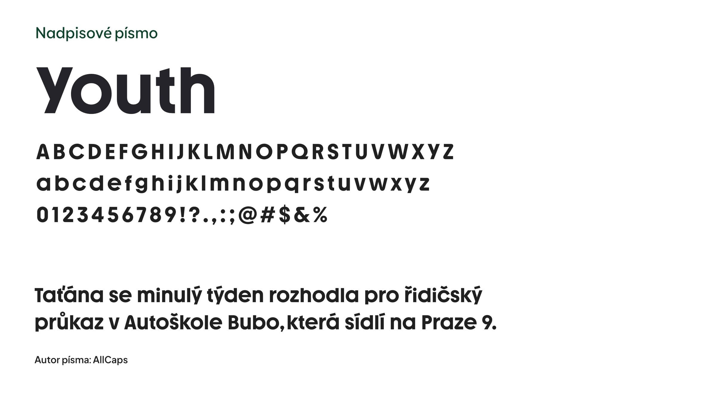
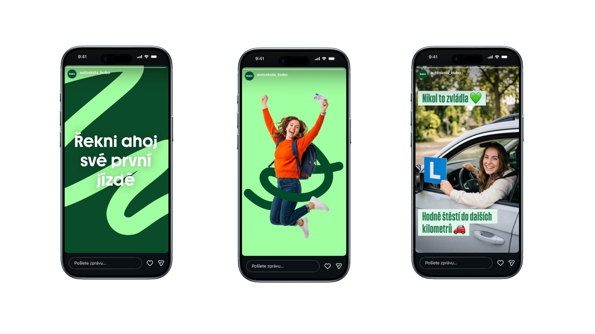
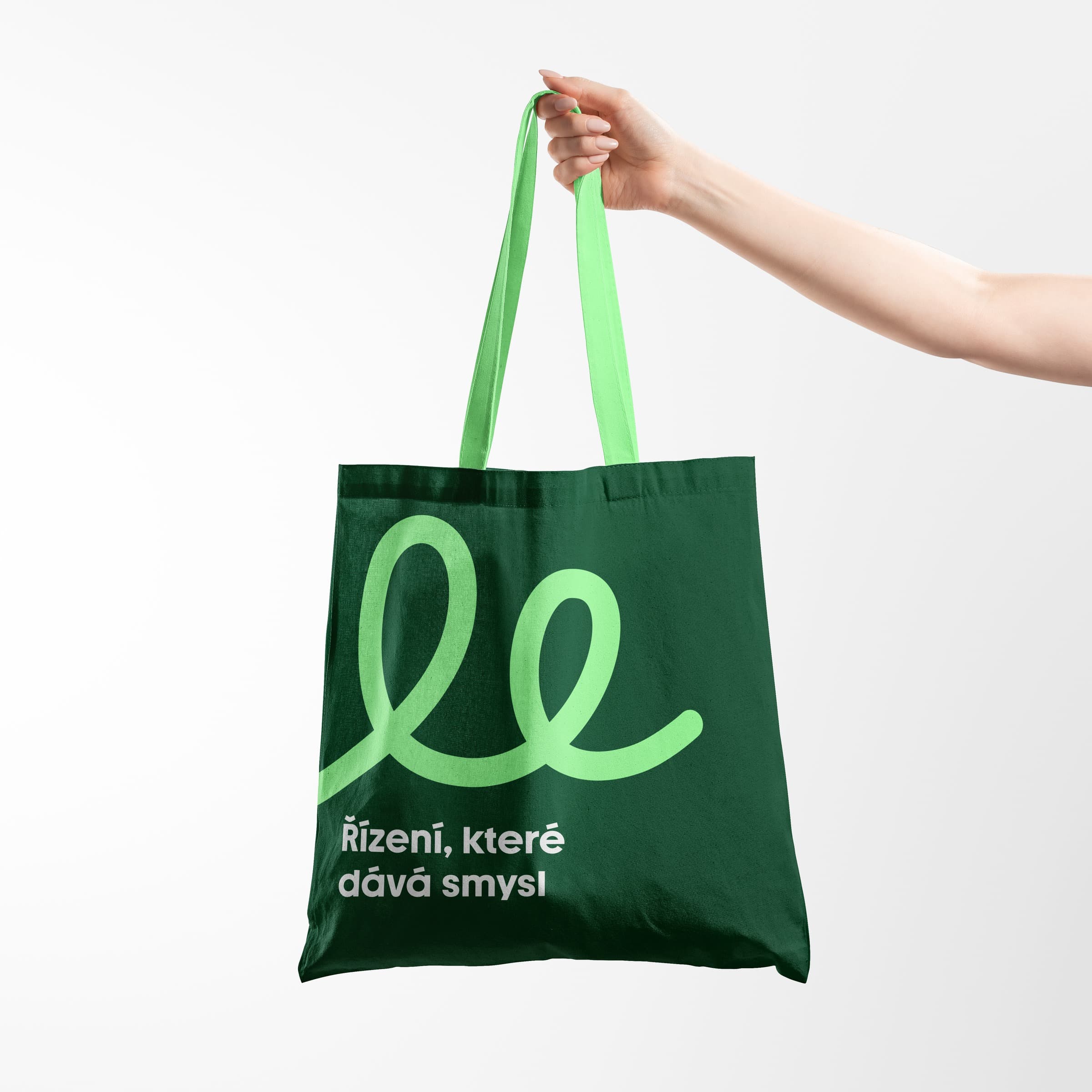
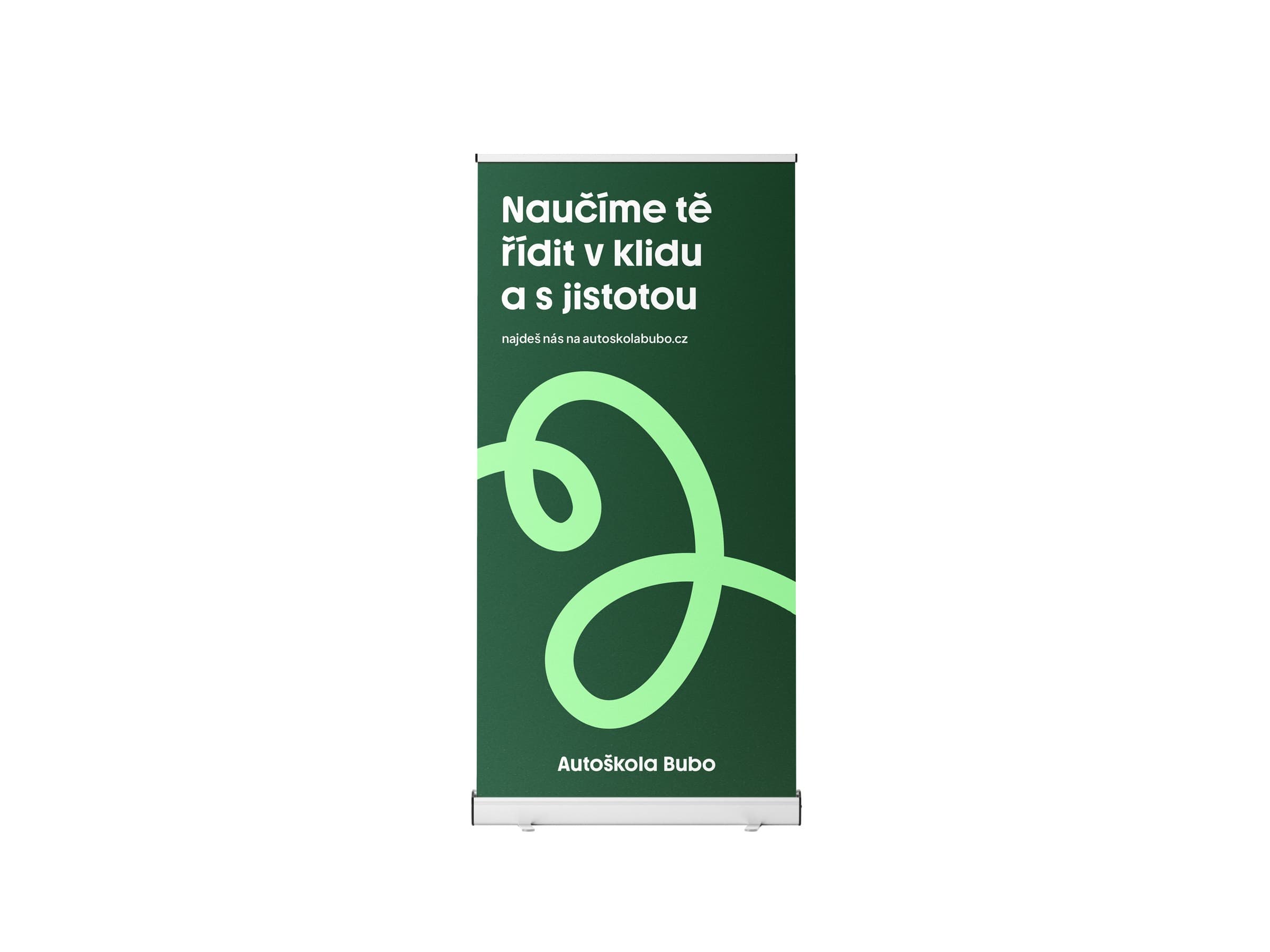
For Autoškola Bubo, a visual identity was designed around the motif of journeys, translated into a system of dynamic graphic lines. These lines aren't just a decorative element — the client can create and combine them independently, actively taking part in building their own brand. The second key element of the identity is typography. The chosen typeface, Youth, with its soft, rounded shapes, naturally complements the character of the graphic lines and supports a friendly, modern, and easily recognizable visual expression for the brand.
Credits: Filip Šimeček, Jan Krblich
CGIBrandingVisual identity
description about the animation
description about the reels